Plot a gamRTMB fit
Arguments
- x
A
gamRTMBfit.- type
"terms"(default),"qq"or"worm".- select
Which terms to draw: an integer index, or a pattern matched against the
parameter: termlabels (e.g."sd"or"s(x1)"). Defaults to all of them.- prob
Probabilities for
type = "quantile". The default is a fine fan; a short vector such asc(0.1, 0.5, 0.9)also gets a legend.- xvar
Covariate for the x-axis of a quantile or density plot. Defaults to the covariate of the first smooth.
- at
Covariate values at which to draw conditional densities. Defaults to five, evenly spaced and inset from the ends.
- se
Draw the interval band.
- rug
Add a rug of the observed covariate values.
- band.col
Fill for the interval band. A solid light grey by default, which renders the same on every device.
- nsim
Randomisation draws to overlay in a QQ or worm plot.
- ask
Draw one panel per page, waiting between them, instead of fitting everything onto one page.
- n
Grid resolution for term curves.
- all.terms
Give parametric terms their own panels in a term plot, alongside the smooths.
TRUEby default; see the section above.- ...
Passed to
plot().
Value
Invisibly, the plotted data, so any panel can be rebuilt by hand:
one data frame per term for type = "terms", the residual quantiles for
the diagnostics, the fitted quantiles for type = "quantile", and a long
data frame of at, y and density for type = "density".
Term plots (type = "terms")
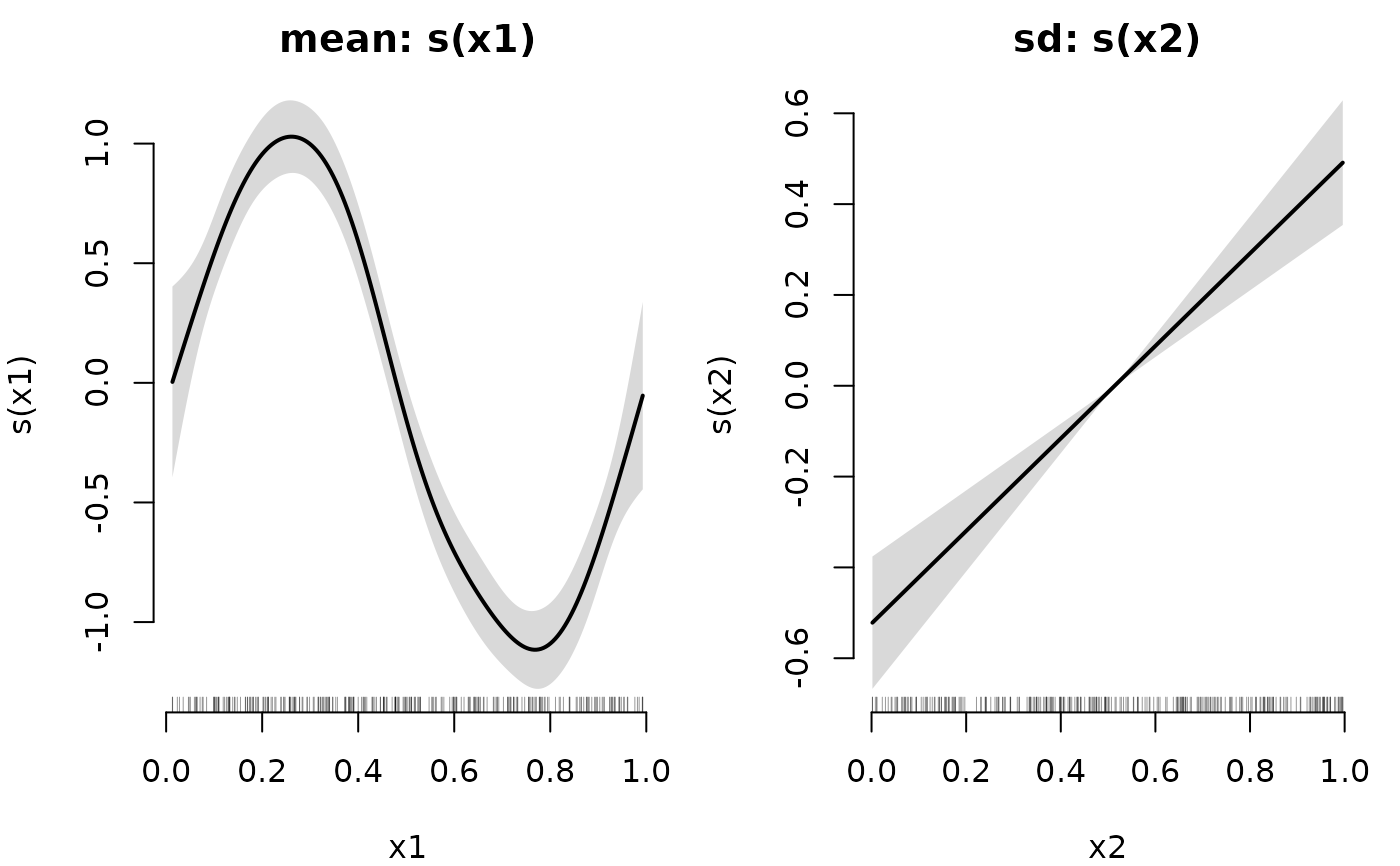
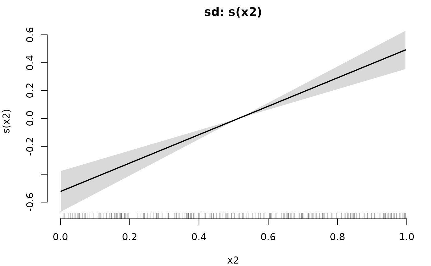
One panel per term, showing its contribution to that distributional
parameter's linear predictor — the scale on which terms are additive — with
a pointwise \(\pm 2\) standard error band. The band comes from
vcov.gamRTMB()'s joint covariance, so it includes the uncertainty in the
smoothing parameters (mgcv's unconditional = TRUE); it needs a fit made
with joint_precision = TRUE, which is the default. Panels are titled
parameter: term, since terms belong to different parameters.
Parametric terms get panels too, as in gamlss::term.plot and unlike
mgcv::plot.gam(), whose all.terms defaults to FALSE. A term is a
contribution to a parameter's predictor whether or not it is penalized, and
what a distributional model is for is usually how those contributions
differ between parameters; a parameter carrying no smooth at all should
still show what does act on it. Set all.terms = FALSE for the mgcv
behaviour. A parametric term's columns are centred at their means over the
fitting data, as in stats::predict.lm() with type = "terms", so a panel
shows the term's variation rather than the level the intercept already
carries. A categorical term is drawn as an estimate and interval per level
rather than as a curve.
Only one-dimensional terms in a single variable are drawn: on the smooth
side that excludes tensor products, random effects (bs = "re") and
factor-smooth interactions (bs = "fs"), and on the parametric side
interactions. They are reported and skipped rather than drawn misleadingly.
Quantile plots (type = "quantile")
Fitted quantiles of the response against one covariate, over the observed data. This is the picture that letting every parameter vary is for: the curves fan out and contract as the fitted spread and shape change, which no mean-only model can show. Other covariates are held at a typical value — the median for a numeric one, the modal level for a factor — so with more than one covariate the points and the curves do not condition on quite the same thing.
A band is drawn for the central curve only, and only for a continuous response. Bands on every quantile would be unreadable, and it is the middle of the distribution whose estimation uncertainty one usually wants next to the spread the other curves already show. Note that this band is the central curve's own uncertainty and is not a prediction interval — the outer quantiles are that.
Conditional densities (type = "density")
The fitted density of the response turned on its side and drawn at a few covariate values, over the data — the shape that the quantile fan only summarises, and the clearest way to see a changing skewness or a changing spread. It uses the family's log-density, so unlike the quantile plot it works for every family.
Densities are scaled to a common width, not a common height, so their shapes are comparable; a lattice response gets a spike per integer rather than a filled outline.
Diagnostics (type = "qq", type = "worm")
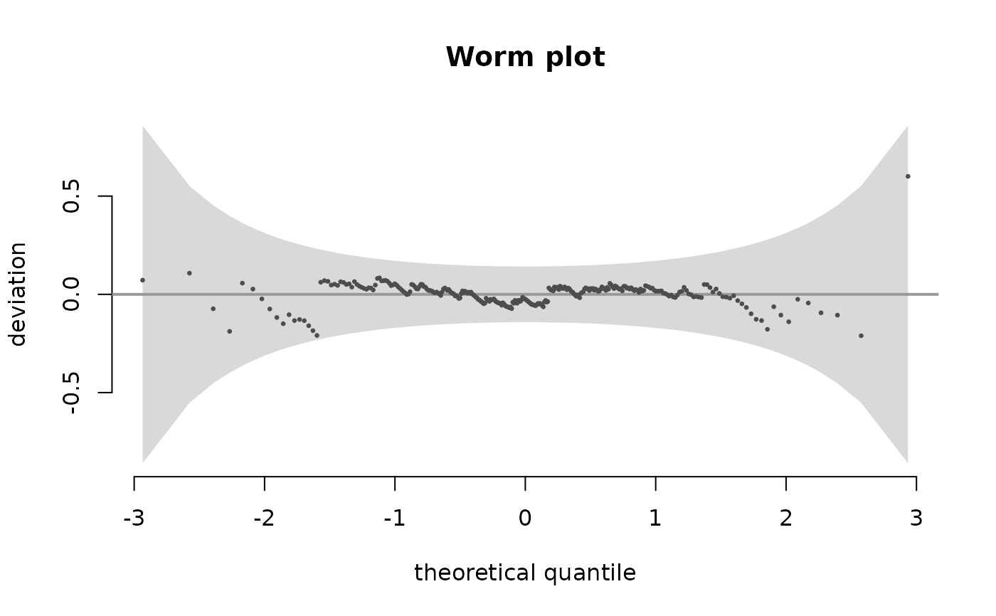
Both use the randomised quantile residuals of residuals.gamRTMB(). The QQ
plot references the identity line, because these residuals should be
standard normal rather than merely normal. The worm plot is its detrended
version — deviation from the theoretical quantile against that quantile —
which makes it much easier to see where a distribution is wrong, with the
usual pointwise 95% band.
For a discrete or mixed response the residuals are randomised, so a single
panel is one realisation; nsim > 1 overlays draws so that the
randomisation is visible instead of hidden. For a continuous response the
draws are identical and nsim has no effect.
Graphical arguments
... is passed to the underlying plot() call, so main, xlim, ylim,
cex and friends work as usual; col, lwd and pch are applied to the
lines and points that are drawn on top. bty = "n" is the default and can
be overridden like any other argument.